Brand Identity, Brand Campaign
Goal:
The Mixed Martial Arts Club at California State University San Bernardino sought a new brand identity and marketing campaign to raise awareness as they felt no one knew they existed. The goal was to bring more student members into the organization, welcoming beginners and intermediates.
The Mixed Martial Arts Club at California State University San Bernardino sought a new brand identity and marketing campaign to raise awareness as they felt no one knew they existed. The goal was to bring more student members into the organization, welcoming beginners and intermediates.
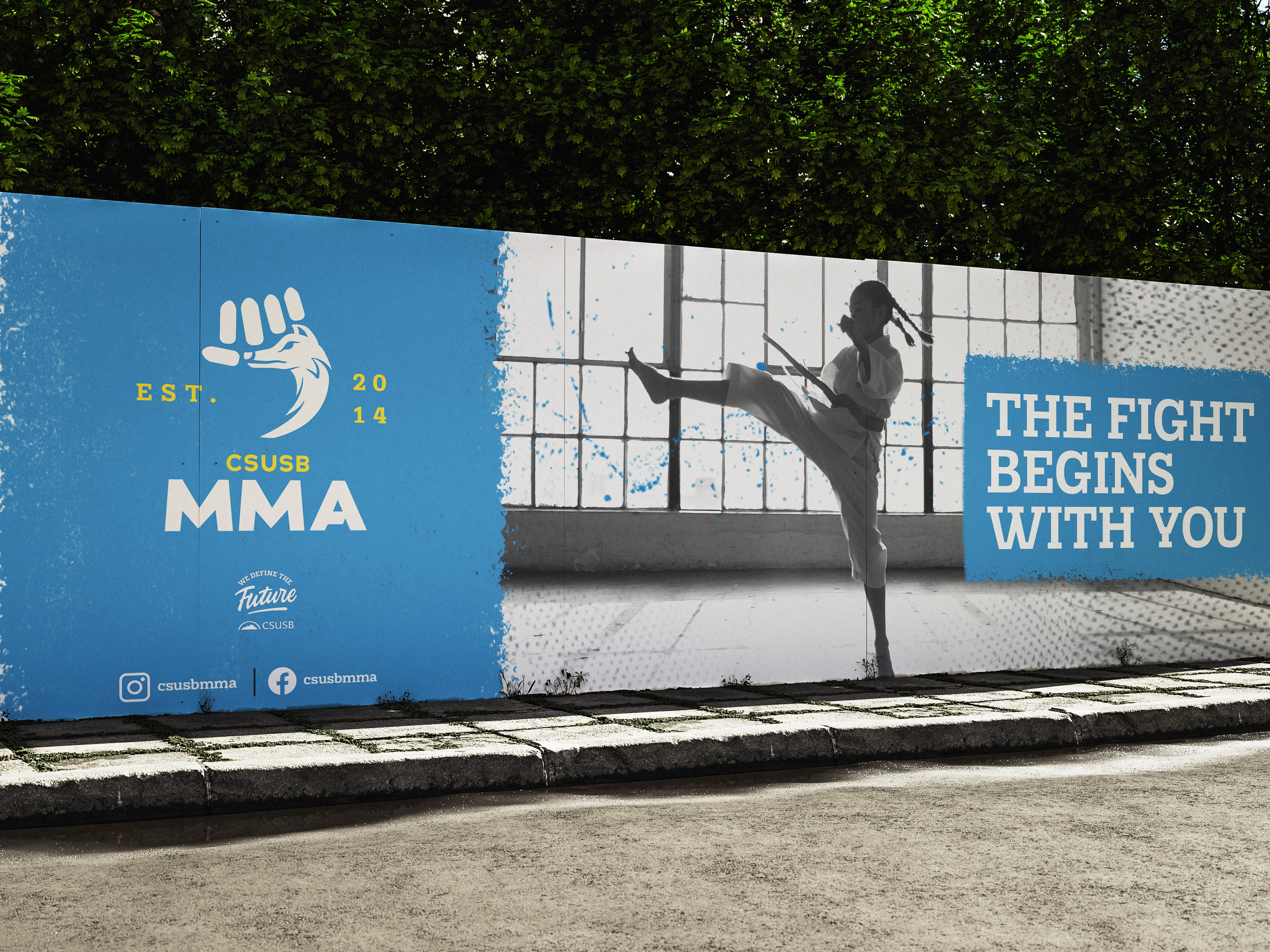
They wanted the new direction to show the brand as empowering, promoting self-defense without encouraging aggression, and focusing on discipline and empowerment.
Services:
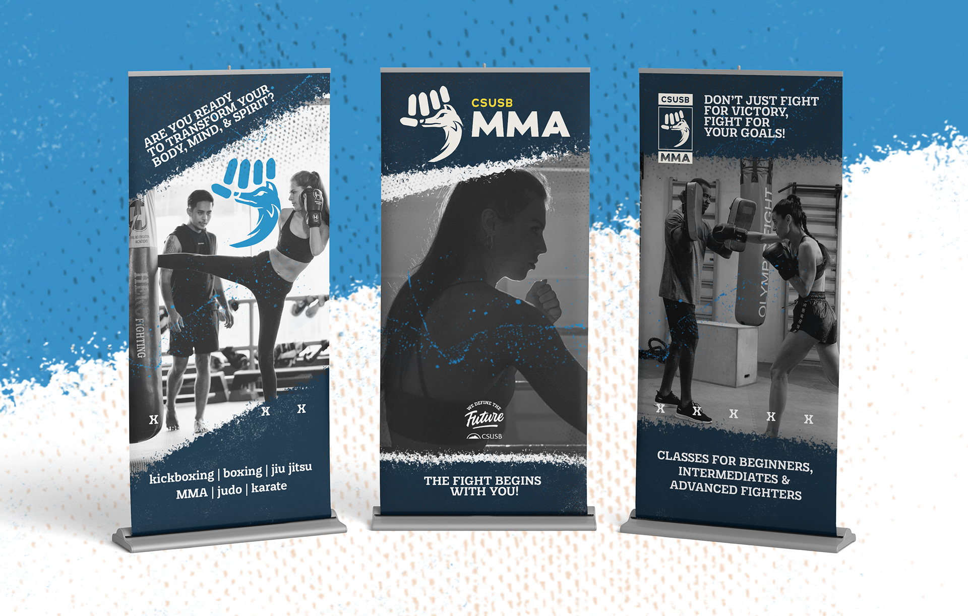
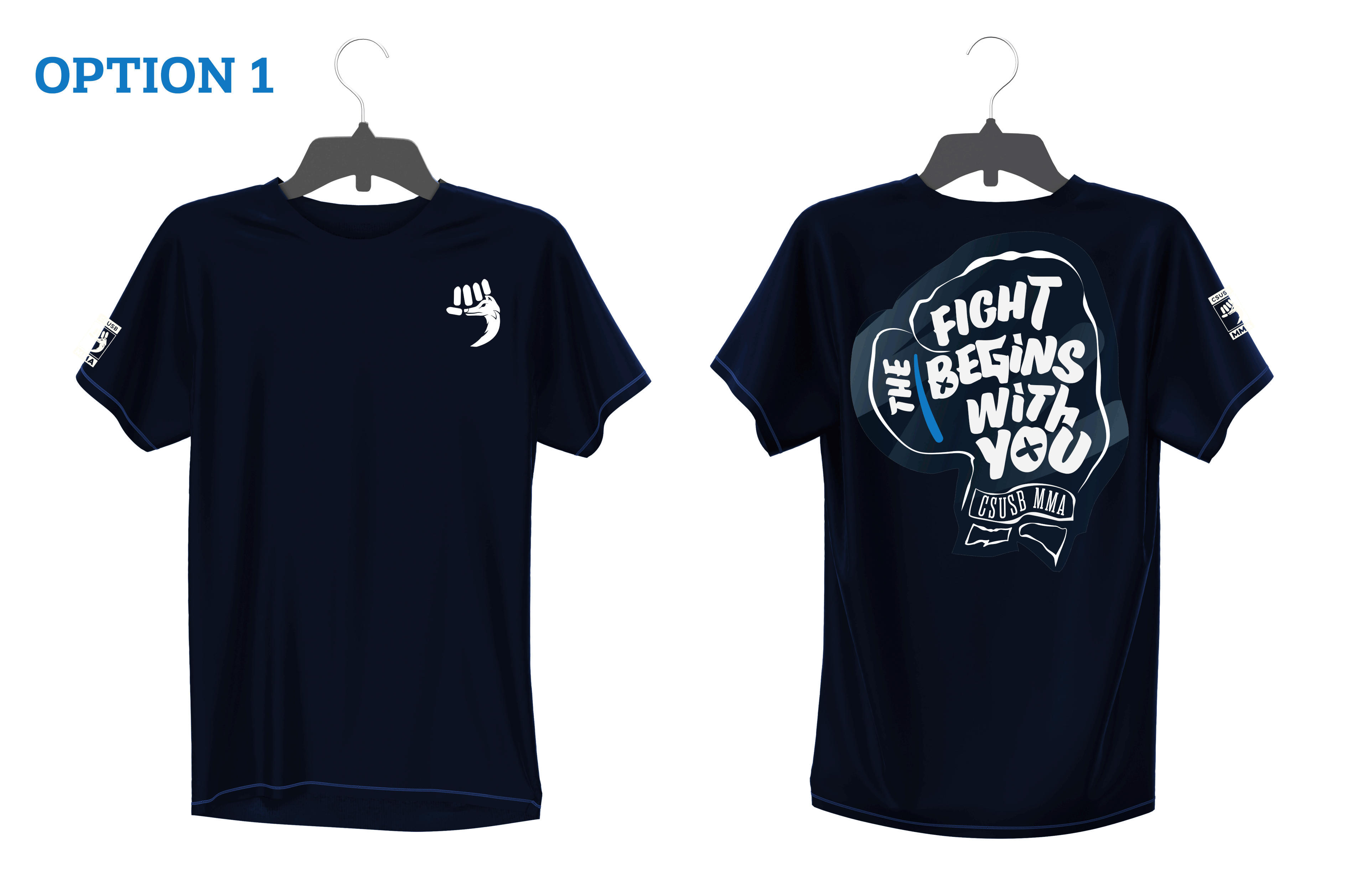
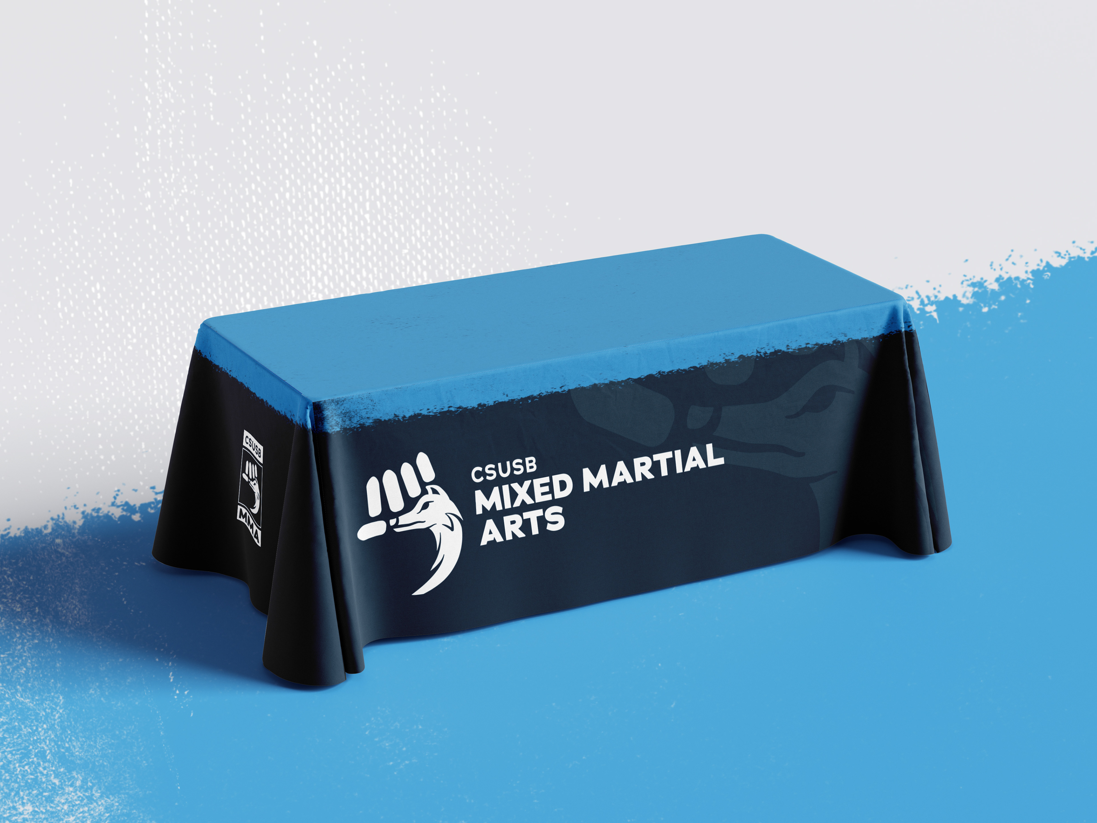
Brand Identity, Logo Design, Brand Campaign, Social Media, Collateral
Brand Identity, Logo Design, Brand Campaign, Social Media, Collateral
Context:
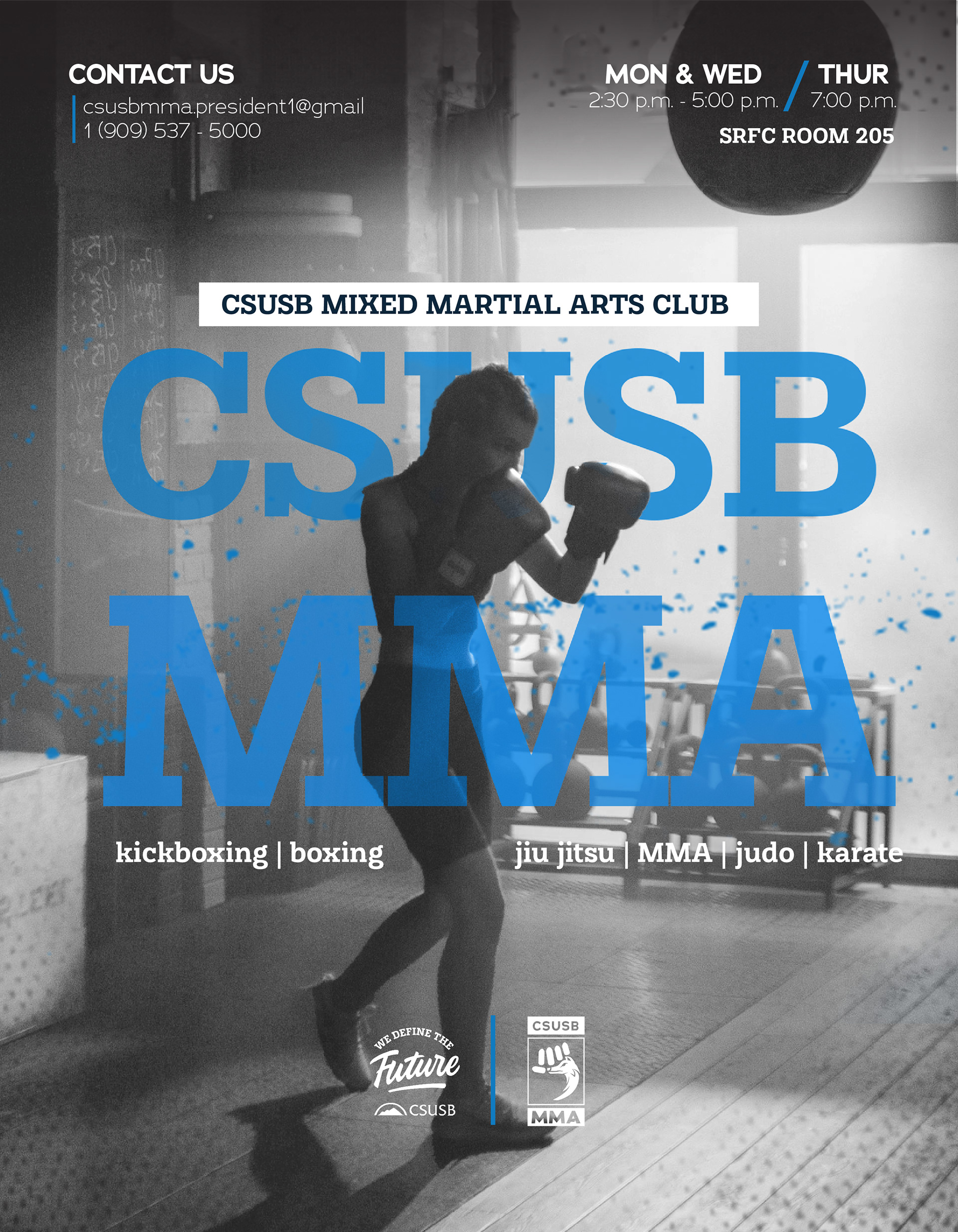
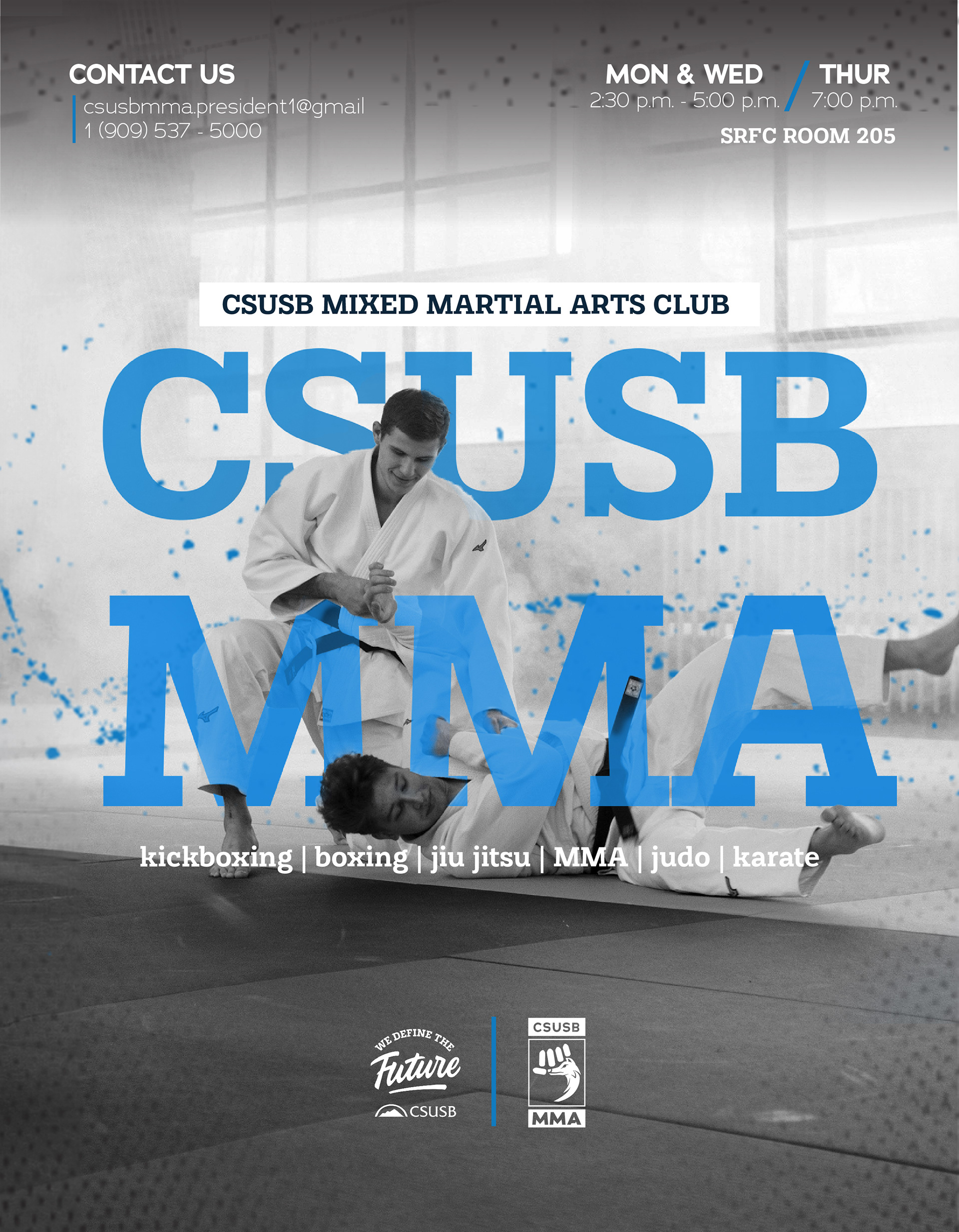
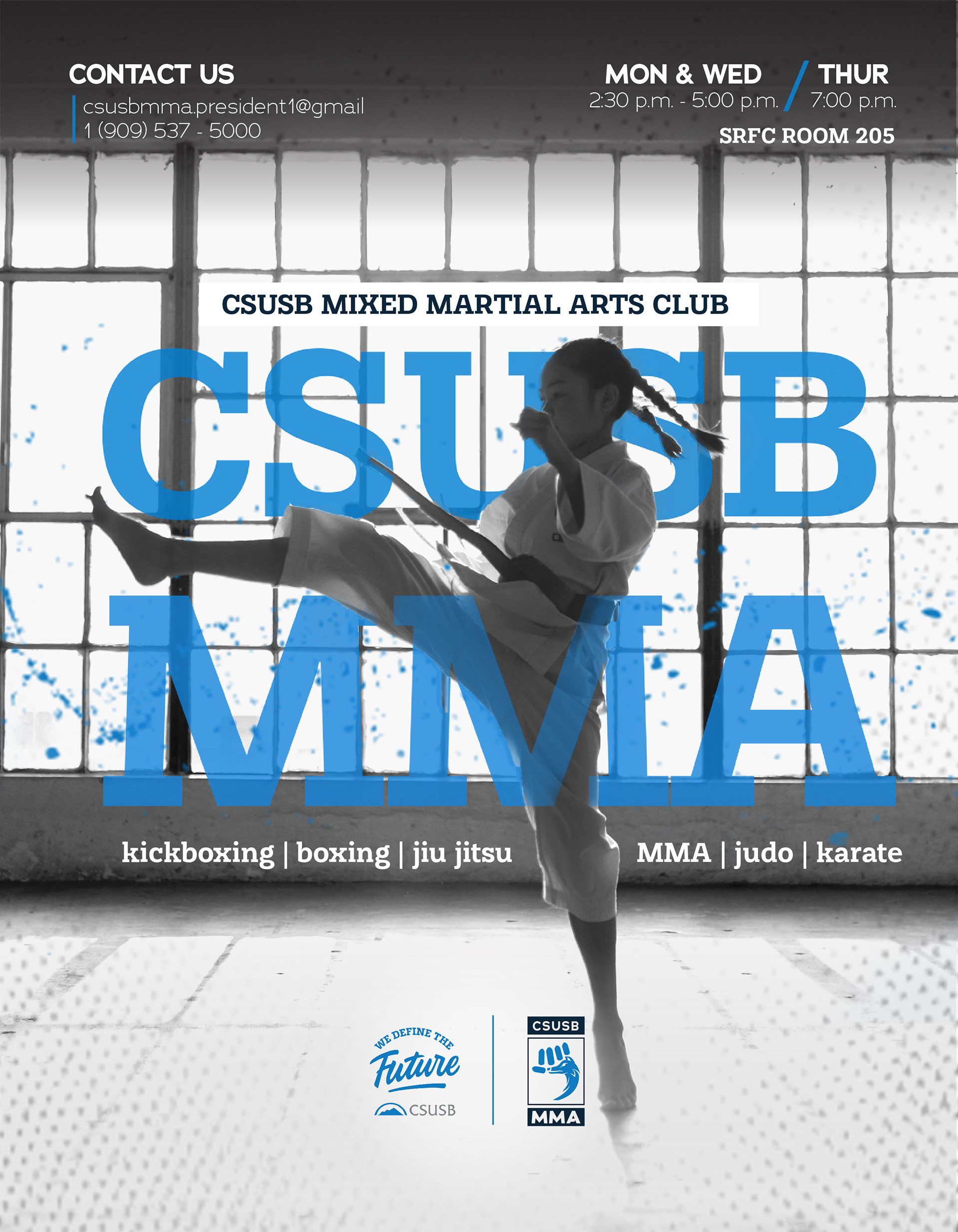
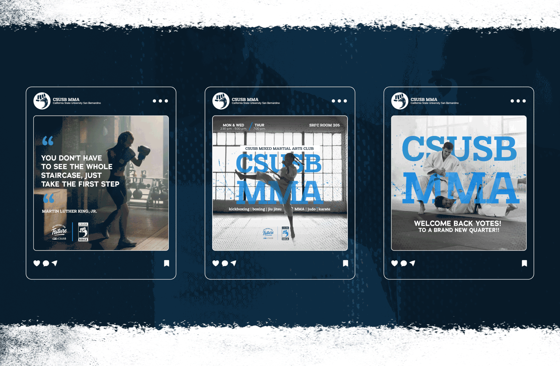
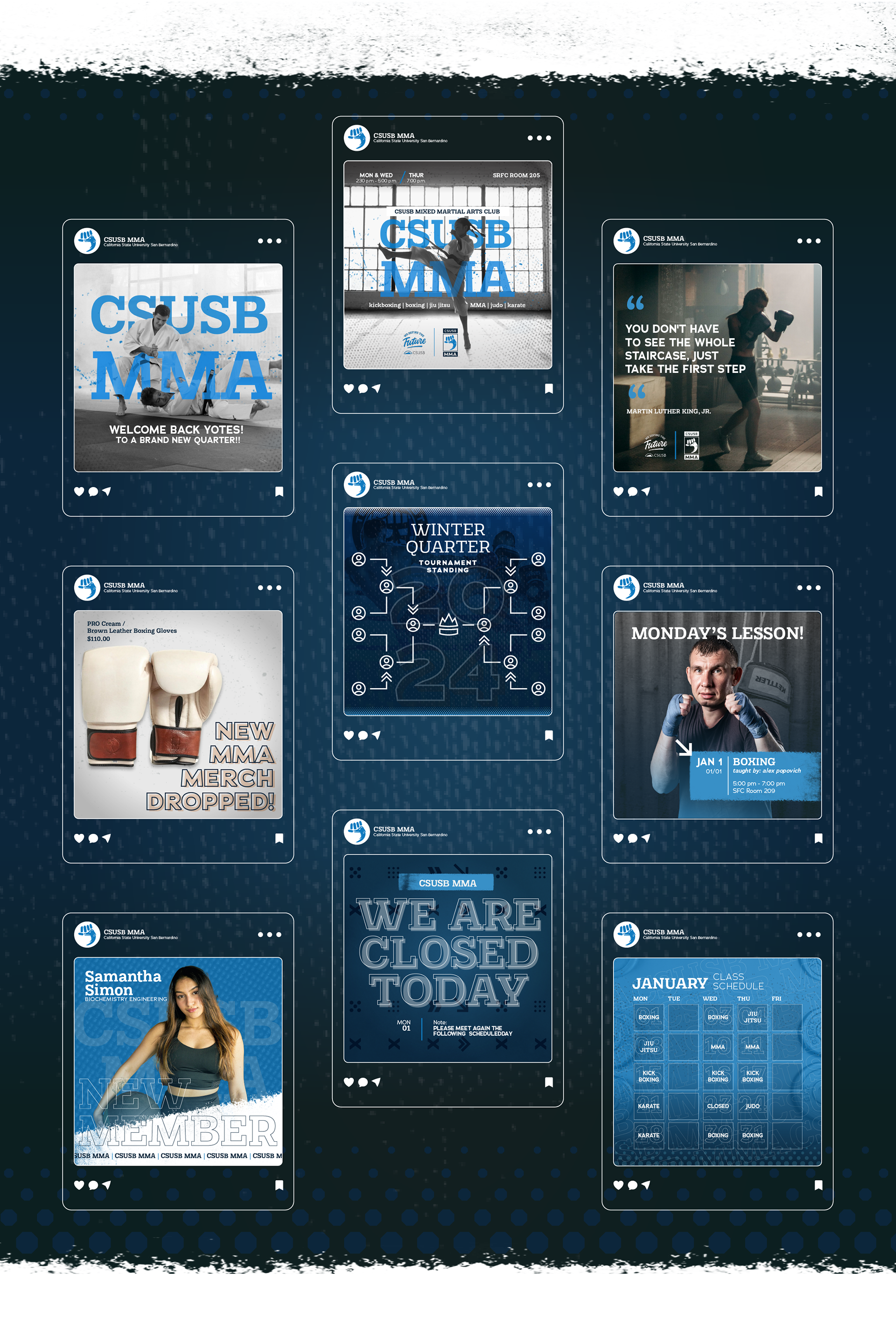
Being a member, I was asked by the president of the club if I could create a flyer to advertise their club. What started as a flyer quickly escalated into creating a new brand identity. After designing the flyer, the president liked it a lot and saw a few more students show up to the next class. From there, he saw that people responded well to it and wanted to create more, and I convinced him that we needed to update the brand itself to better match the aesthetic that people wanted to see.
Being a member, I was asked by the president of the club if I could create a flyer to advertise their club. What started as a flyer quickly escalated into creating a new brand identity. After designing the flyer, the president liked it a lot and saw a few more students show up to the next class. From there, he saw that people responded well to it and wanted to create more, and I convinced him that we needed to update the brand itself to better match the aesthetic that people wanted to see.
Process:
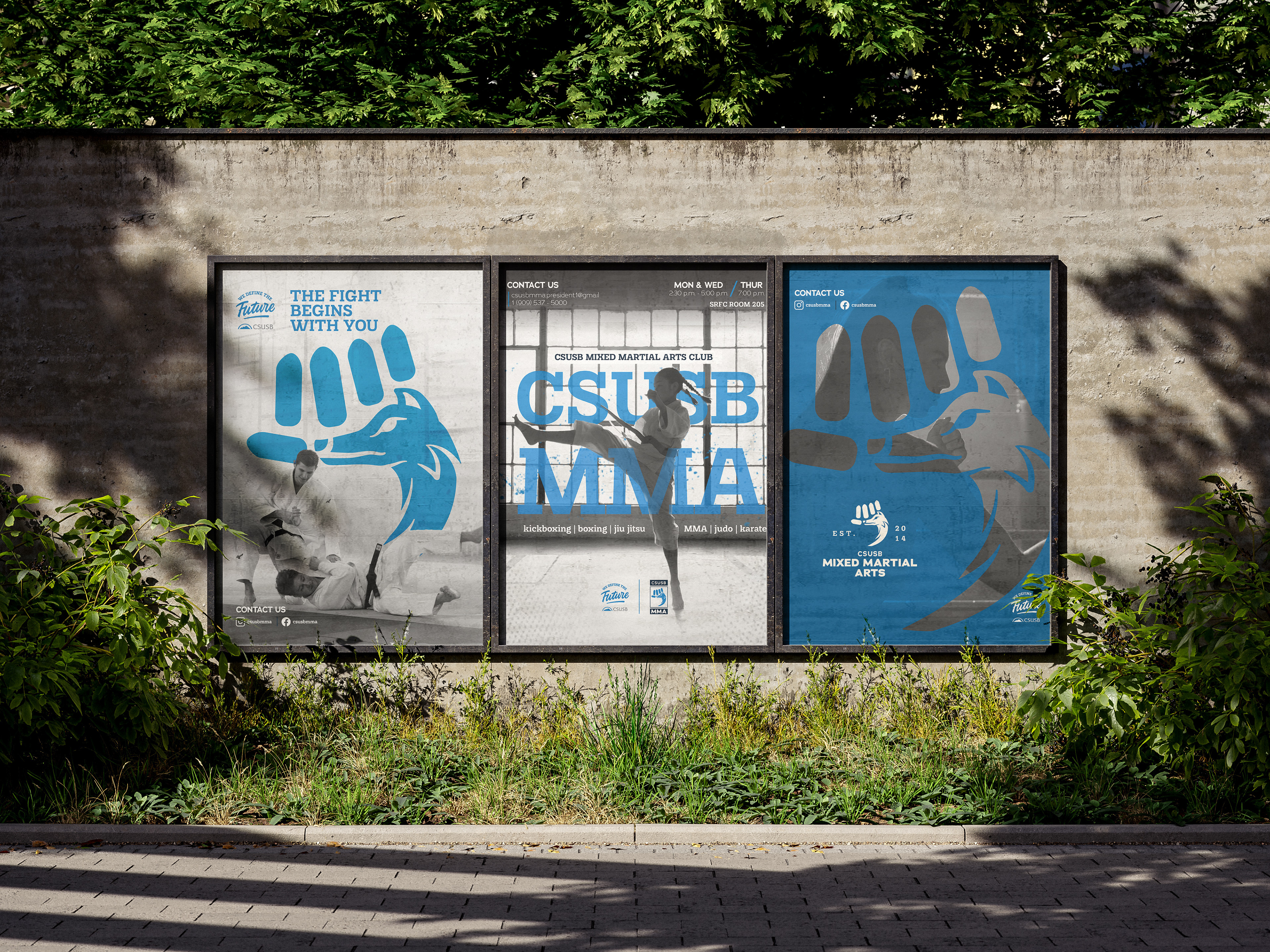
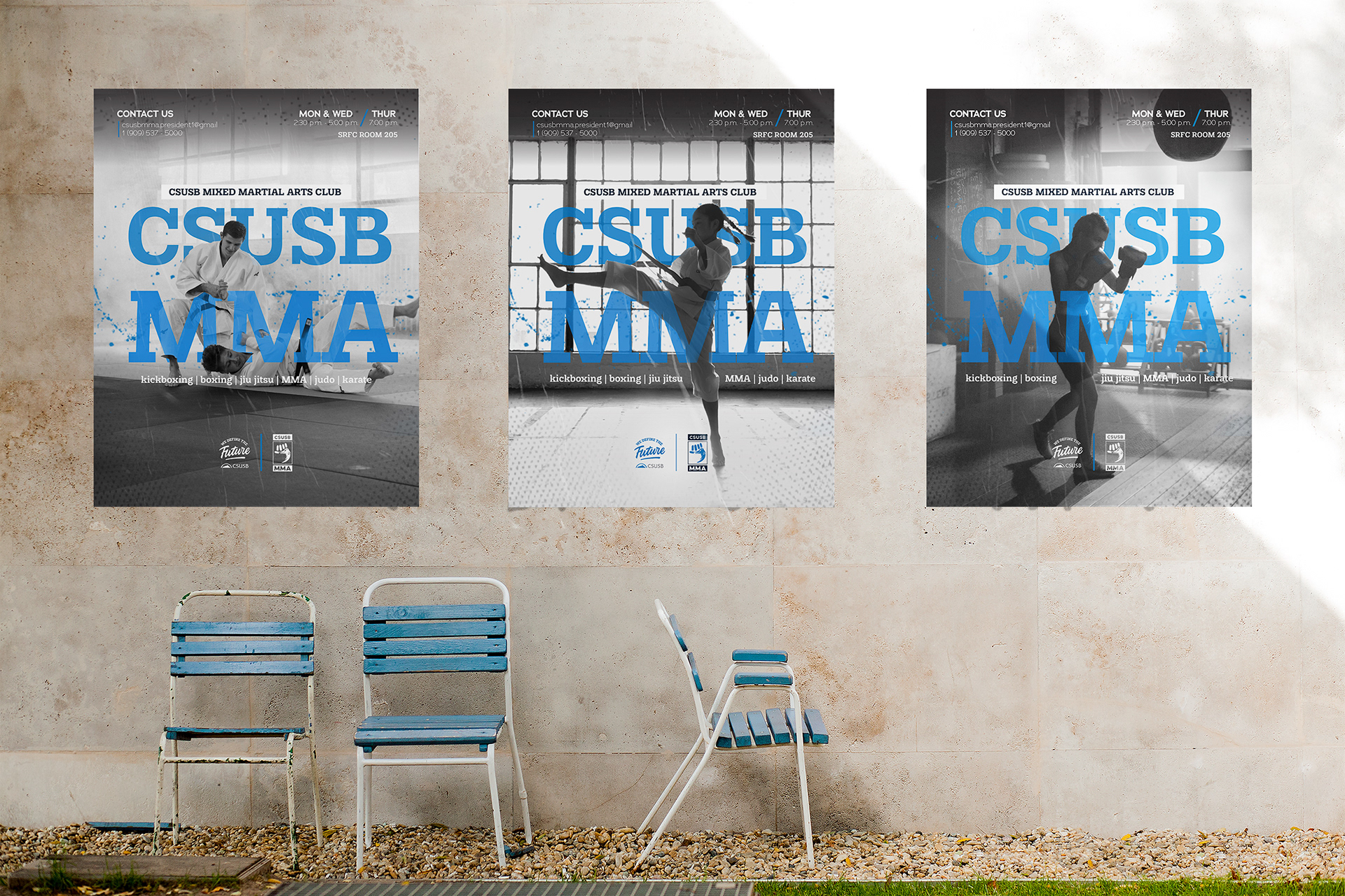
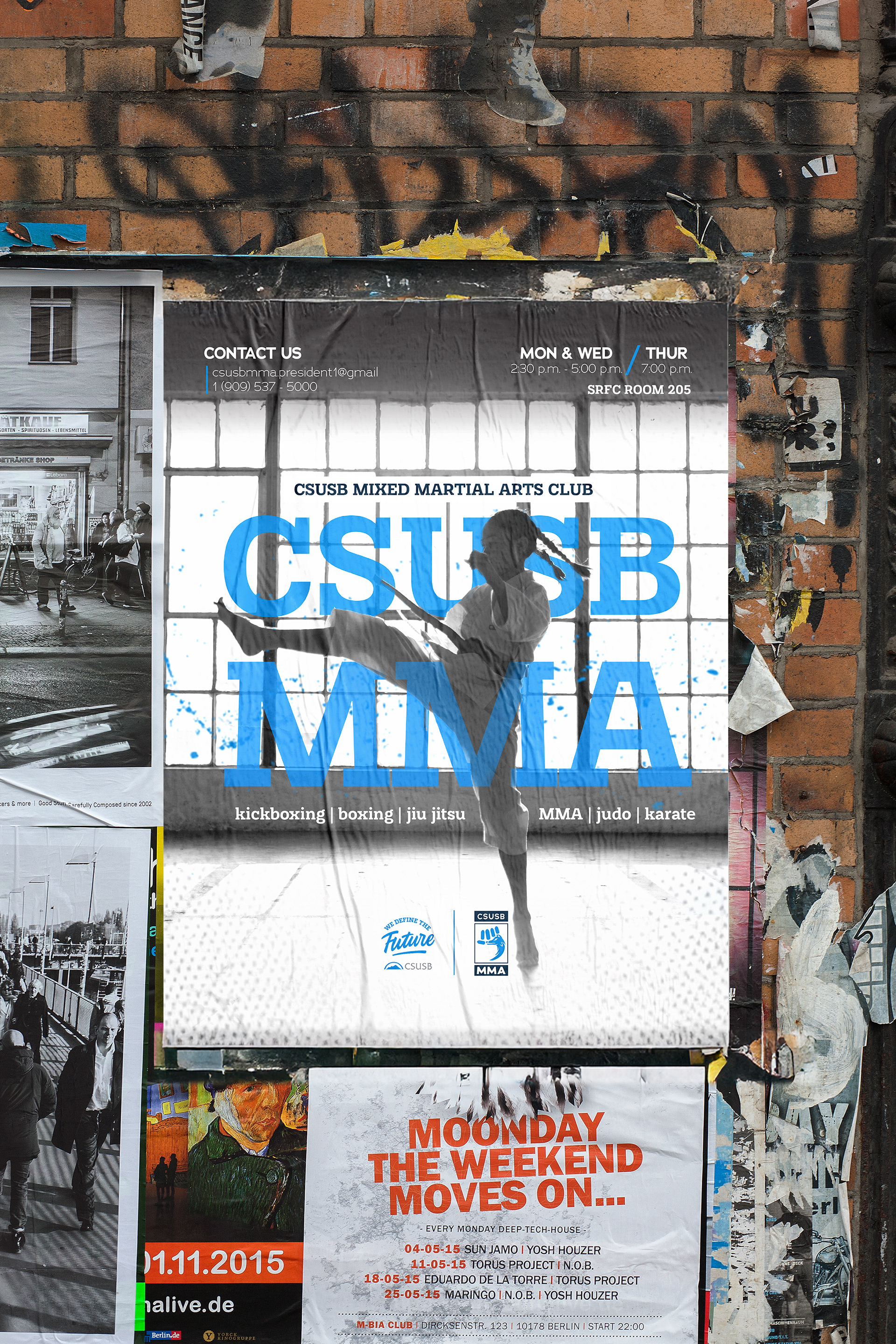
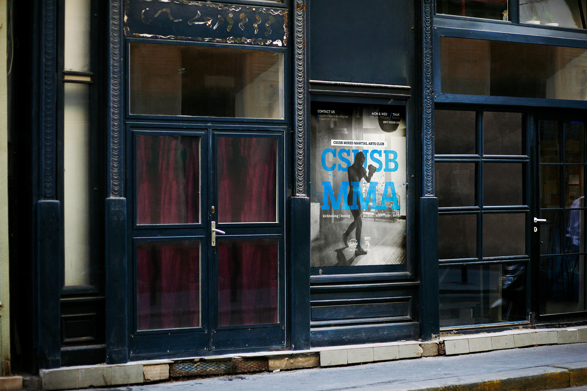
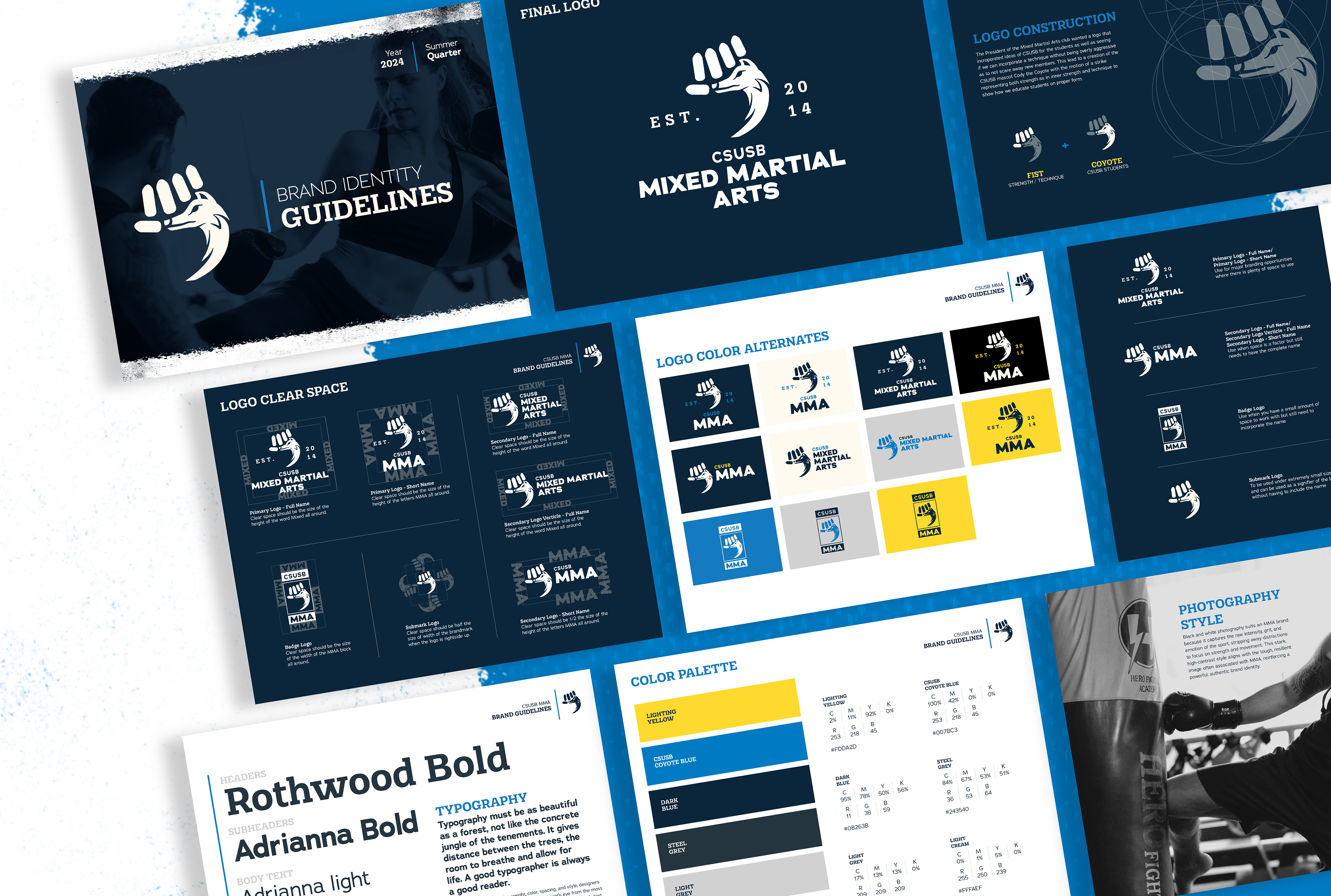
Designing the flyer gave me a good starting point for how to move the brand forward, as it showed the principles that the club stood for. I did my research into martial arts brands and how they presented themselves, and what I saw was that most focused on aggressive images focusing on power and strength. When I started designing the brand itself, I did not want to show the stereotypical images people think of but a brand that focuses on technique and determination.
Designing the flyer gave me a good starting point for how to move the brand forward, as it showed the principles that the club stood for. I did my research into martial arts brands and how they presented themselves, and what I saw was that most focused on aggressive images focusing on power and strength. When I started designing the brand itself, I did not want to show the stereotypical images people think of but a brand that focuses on technique and determination.
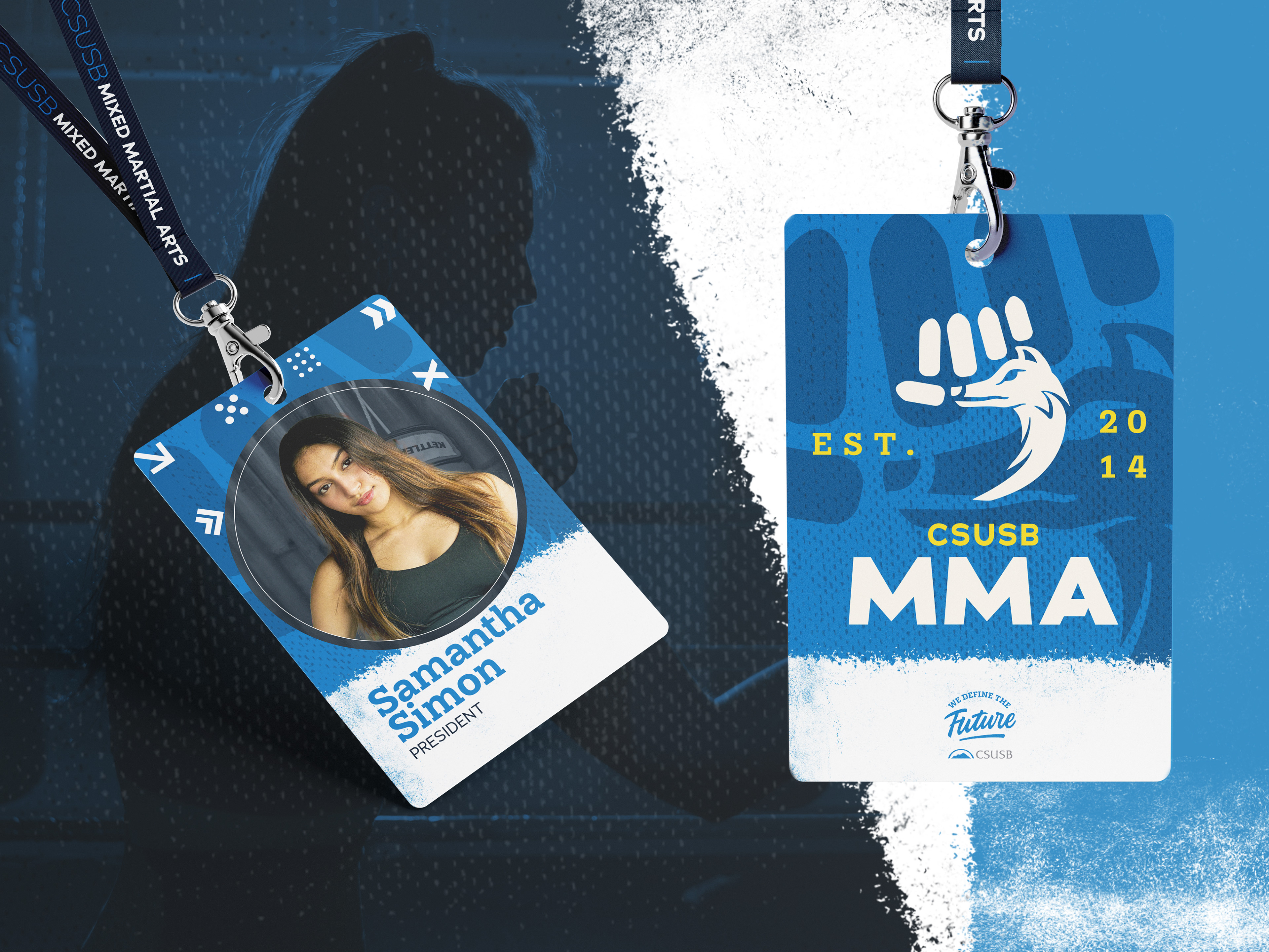
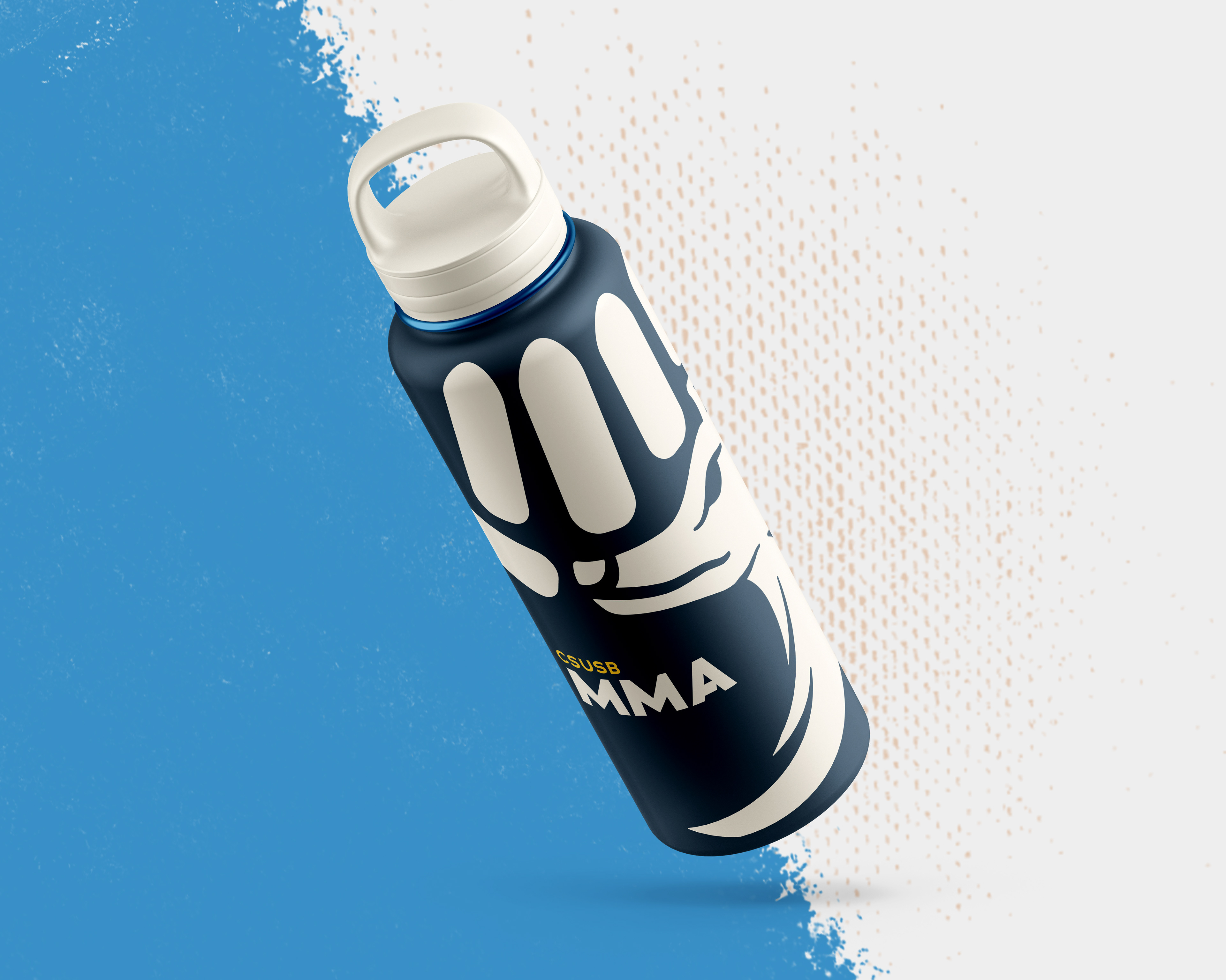
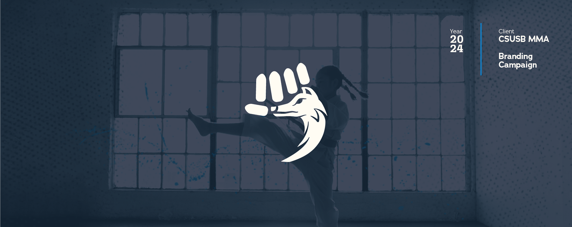
After all my research, I began working on the logo, focusing on technique and empowerment and trying to bring in the mascot of the school. I saw that most logos in MMA used an aggressive mascot in their logo, and I wanted to bring that in while also subverting it to not be so aggressive. Finally, I designed a logo that worked both as a fist and with the coyote as the arm, showing that it's not about being aggressive but about using technique to properly defend yourself.
Outcome:
A record number of new students came in to join the next school quarter eager to learn how to defend themselves.
A record number of new students came in to join the next school quarter eager to learn how to defend themselves.
Impact:
The number of classes and instructors had to increase due to overwhelming demand. This led the club to refocus on its structure to see how to properly accommodate new members without having to turn them down.
The number of classes and instructors had to increase due to overwhelming demand. This led the club to refocus on its structure to see how to properly accommodate new members without having to turn them down.